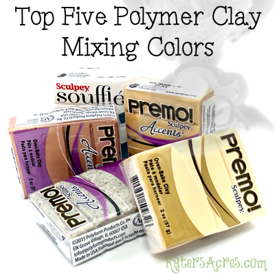
If you are familiar with making your own color recipes or color palettes, then you probably have familiarized yourself with your favorite polymer clay colors to use for mixing clay colors. If you aren’t familiar with the way that I mix colors you can get my clay mixing worksheet here. Without further ado, let me show you what top five mixing clay colors I can’t be without.
When you are looking for the perfect mixing clay color, what exactly are you looking for? I think it depends on what type of palette you are making and what type of tone you are trying to set for that color palette. But so often when I make a color palette, I want to set the tone of that palette by creating a look that is playful, fun, and lively. At least that’s what I like to do for my palettes. Remember that when you create a color palette, it’s all about balance. A palette can have just 3 colors, or 18. But they should all look like they were born together and were meant to go together. Finding clay mixes that work well together is one great way to make sure that happens. For many of my palettes, I tend to use one of the same five mixing clay colors over and over. So today that’s what I thought I’d share with you, my favorite, Top Five Mixing Clay Colors.

- Sculpey Soufflé in Igloo (White)- I like using this because with just a small amount I can brighten any shade and make the clay instantly “fluffier.” But at the same time, with a larger amount, I can turn any color into a tint of whatever color I’m working with.
- Premo! 18k Gold – One of my favorites. I love that this color has rich warm undertones. This means that it has the capability to warm up any color palette. I love little tiny pinches here and there, for tiny little hints of something special without being overtly metallic. NOTE: Be very careful using this on cool toned palettes as it will turn them the opposite of what you may be expecting, especially in large doses.
- Premo! Granite – Another all time favorite. This is a great way to add an instant texture, question, and bump to your clay without being overtly fancy or metallic. It’s a quick way to add a “natural” element into a color palette. You can be very heavy handed with this color or ultra conservative and the effect still holds. I love that about this color!
- Premo! Ecru – One of my favorite ways to neutralize any palette is simply to add a dash of Ecru to it. This color not only has the power to neutralize your palette but it can also mute and tone down colors without brightening them like pure white does. Like white though, be very careful in using this; a little goes a very LONG way.
- Last but not least, Premo! Copper – To me, this color looks a lot more like rose gold than copper, however … I use Premo! Copper in place of 18k gold in cool toned palettes. Like it’s brother, it can be used in both small and large amounts. I find this to be highly metallic and another one where a little goes a long way. Be careful you don’t add too much of this clay into one color.


